RIO DE JANEIRO TRAVEL MAGAZINE CONCEPTS
In an era of rapidly evolving design trends and shifting consumer preferences, visual aesthetics play a large role in shaping perceptions and emotions. This case study explores travel magazine design, aiming to unravel the connection between aesthetics and message/emotion.
By creating two versions of the same travel magazine, one embracing minimalism and the other a multi-media/playful aesthetic, this experiment aims to uncover the extent to which design choices influence the reader's perception and emotional engagement.
OPTION 1: MULTI-MEDIA
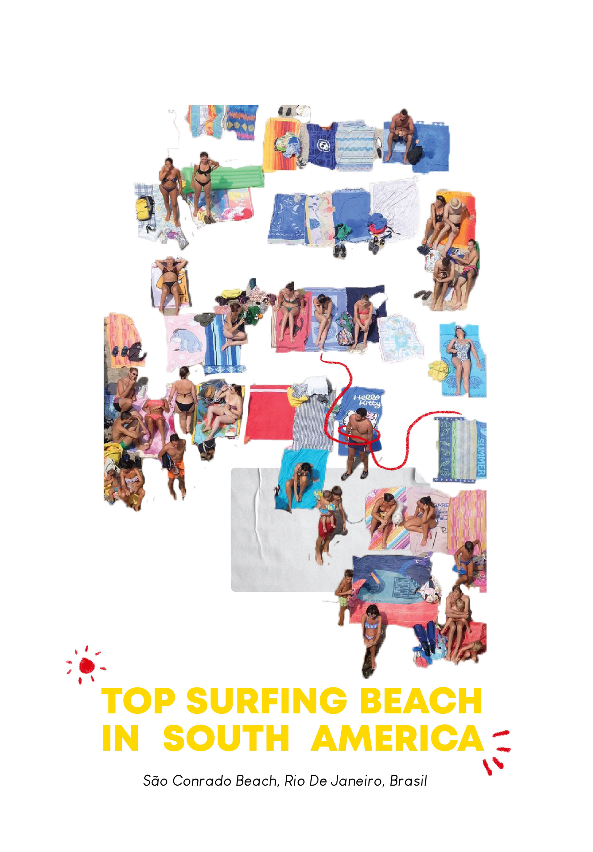
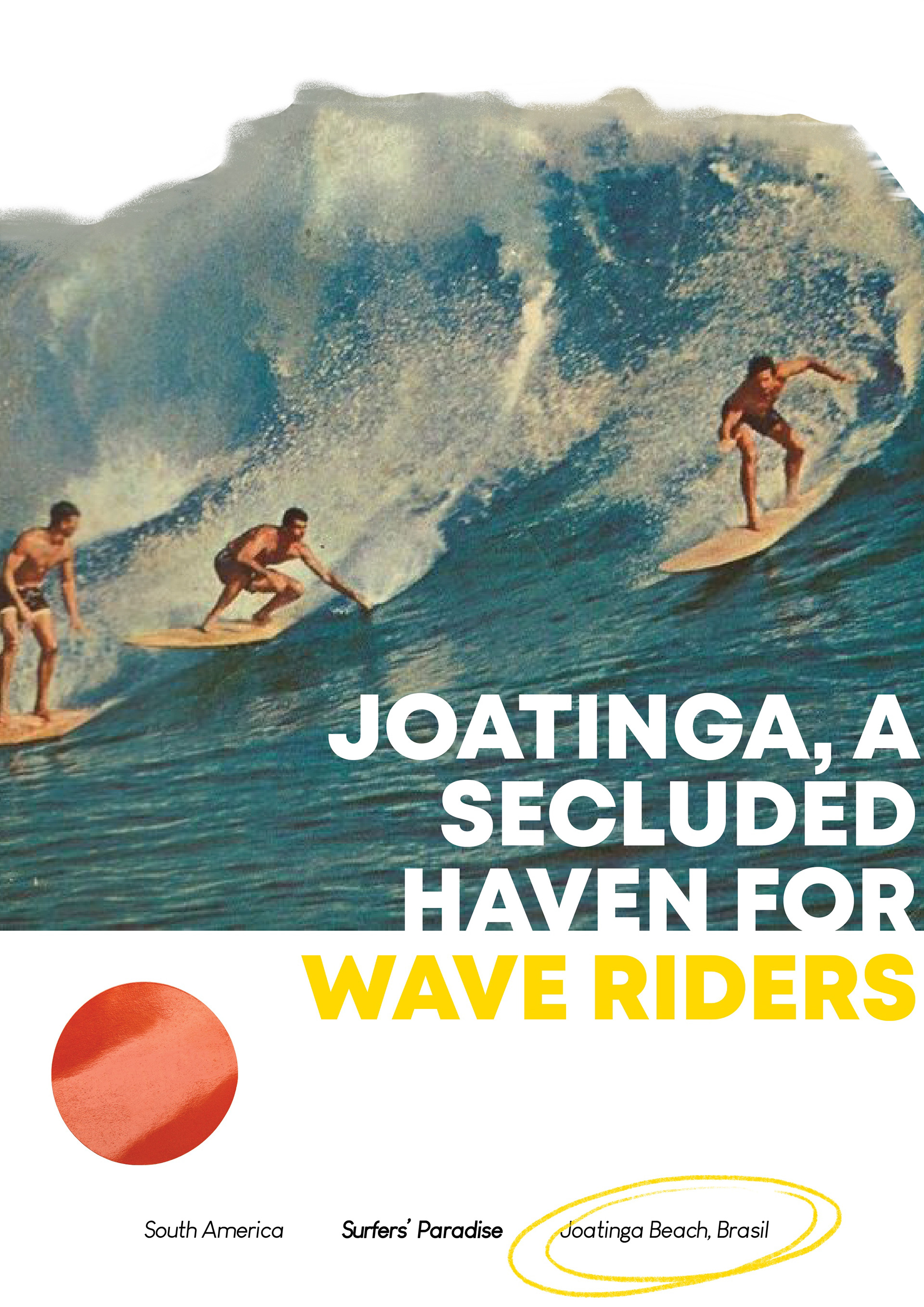
See below a more immersive approach to a travel magazine. With playful font combinations and added motifs, the magazine is given a more youthful and fun aesthetic. By using cutouts and hand-drawn design elements, the arrangement is able to interact with itself and play off of its own layout. Using a two contrasting typefaces as headings, and a sans serif typeface for the body, the hierarchy is still obvious and doesn't lose the message in the design.
Tools used: Procreate, PhotoShop, Illustrator
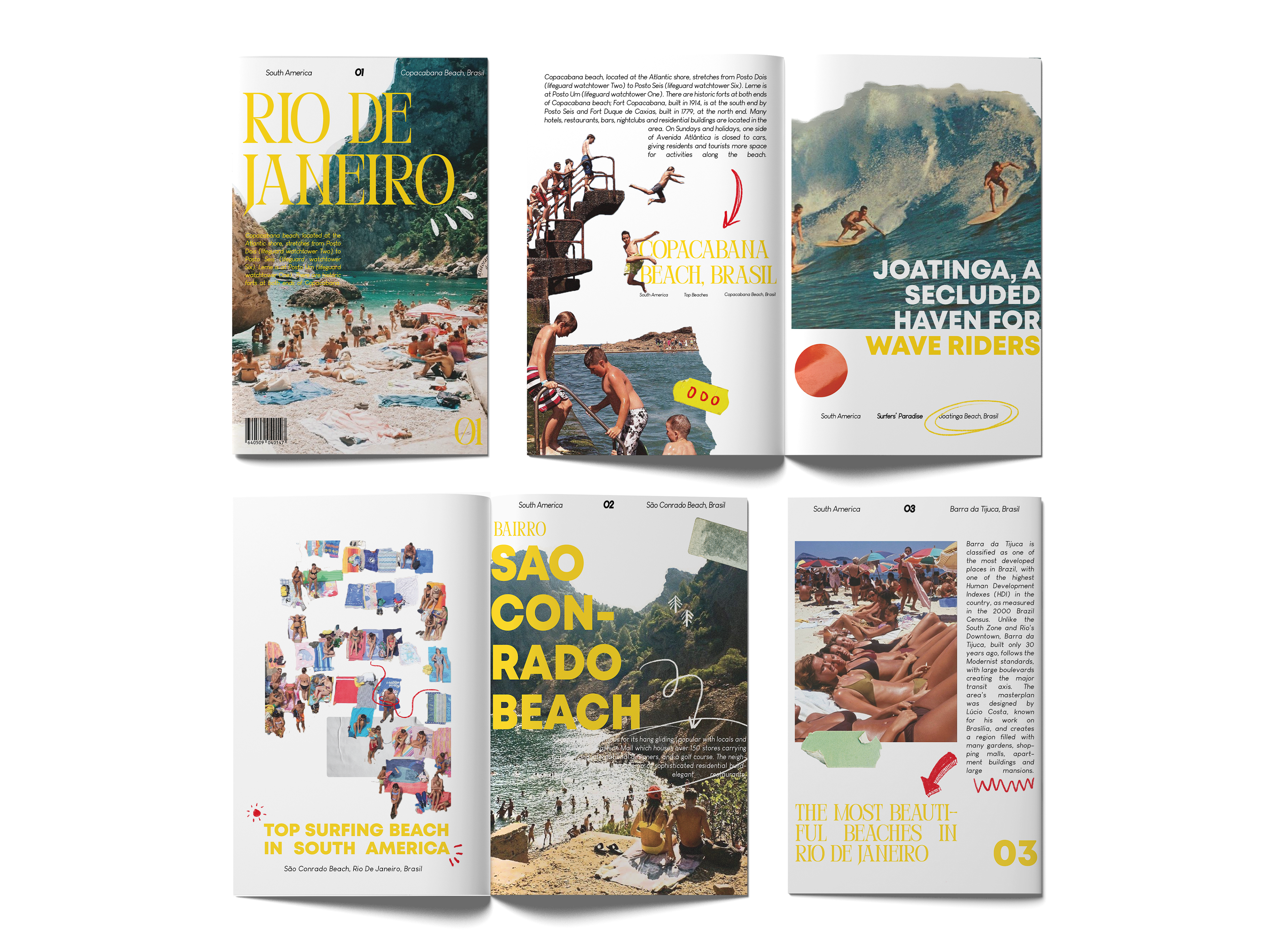


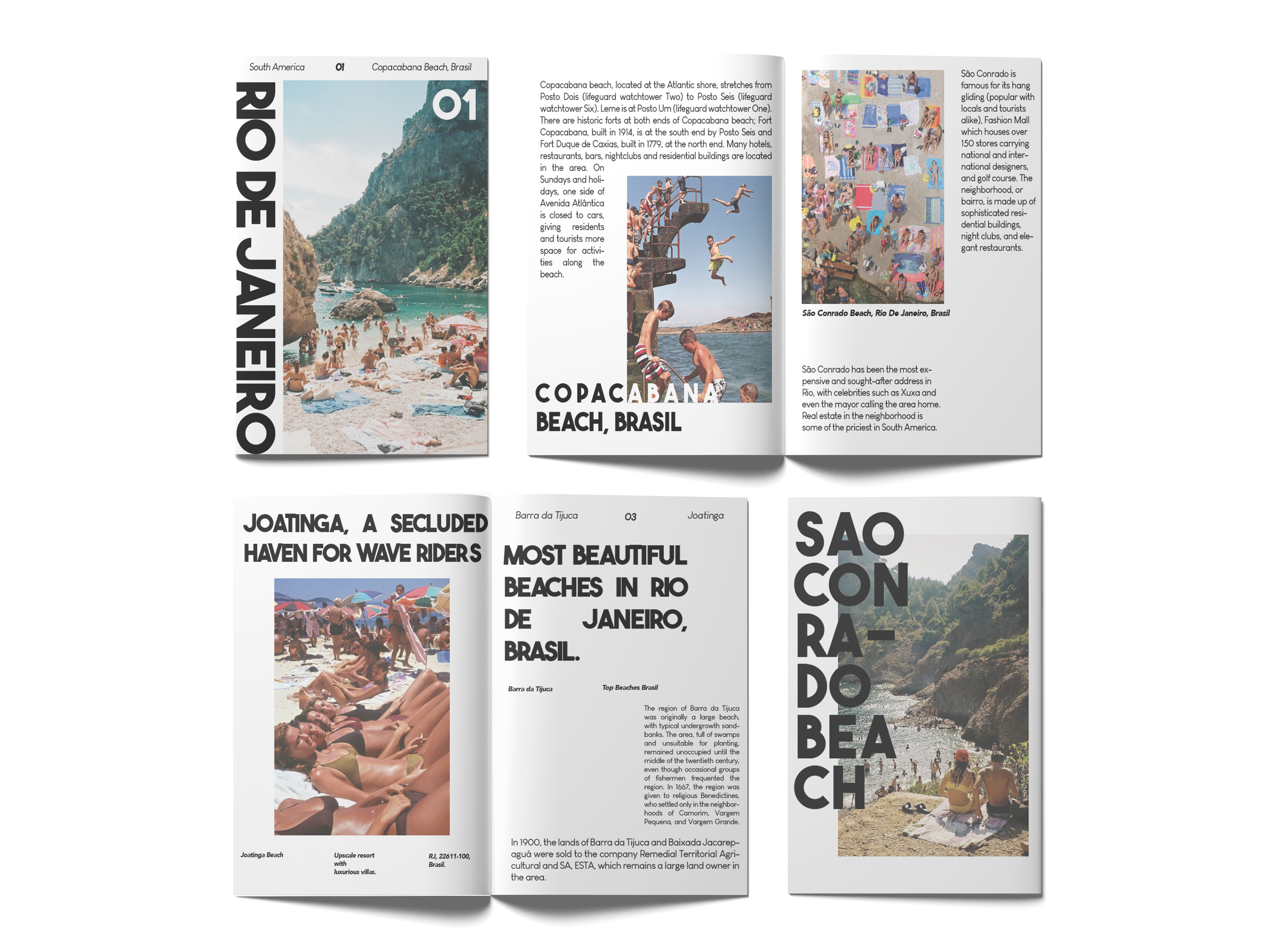
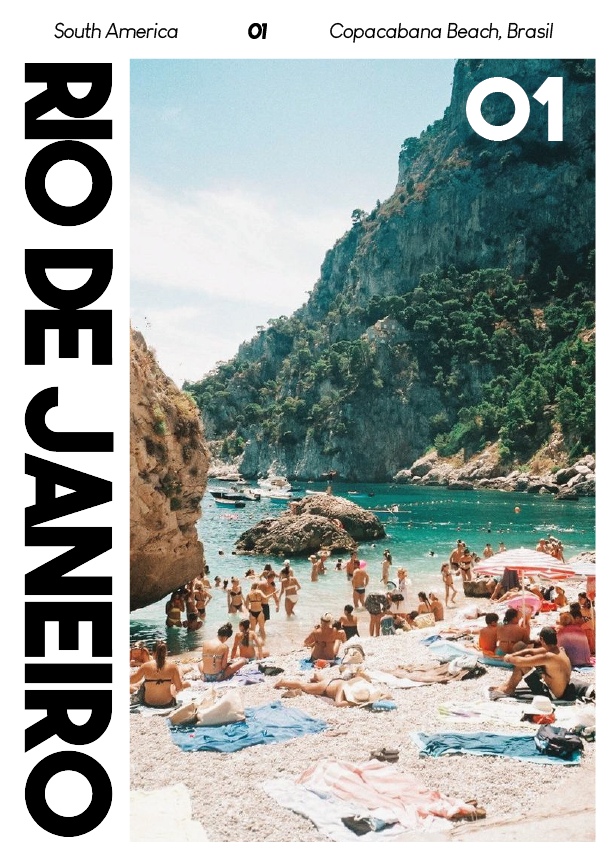
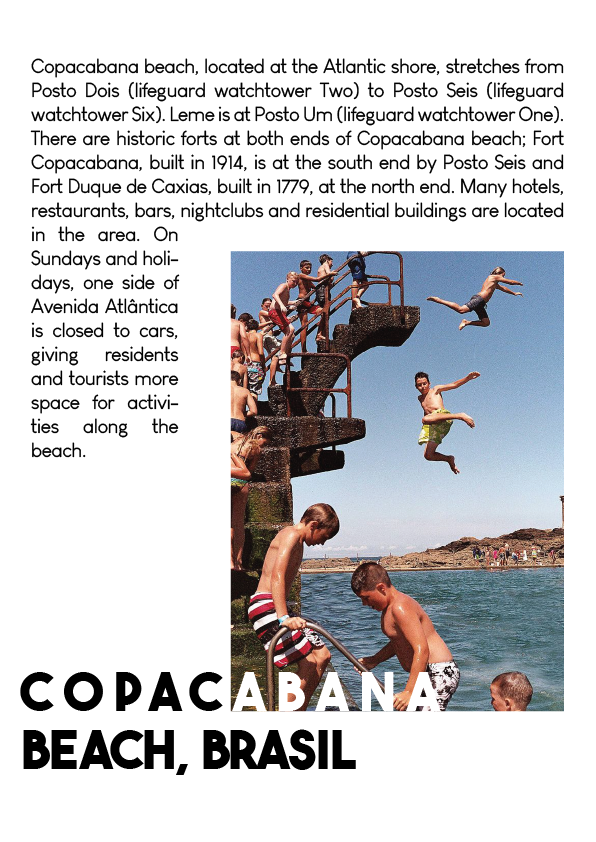
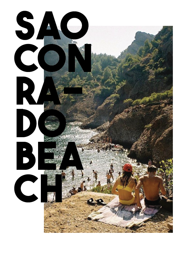
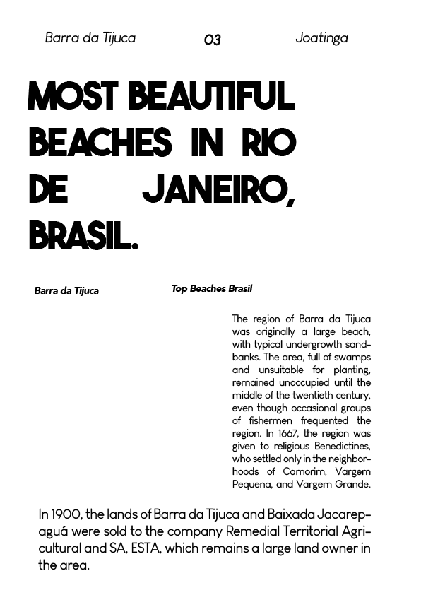
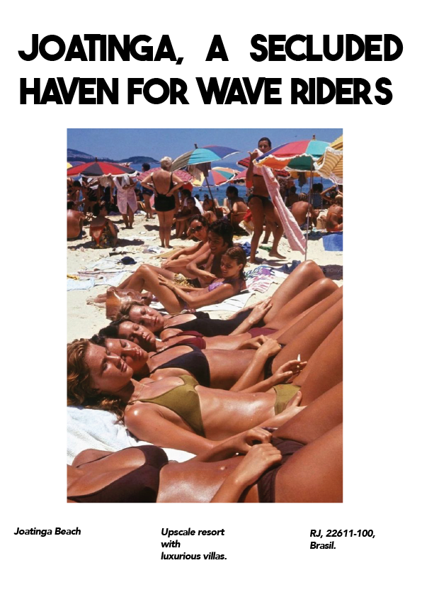
OPTION 2: MINIMAL
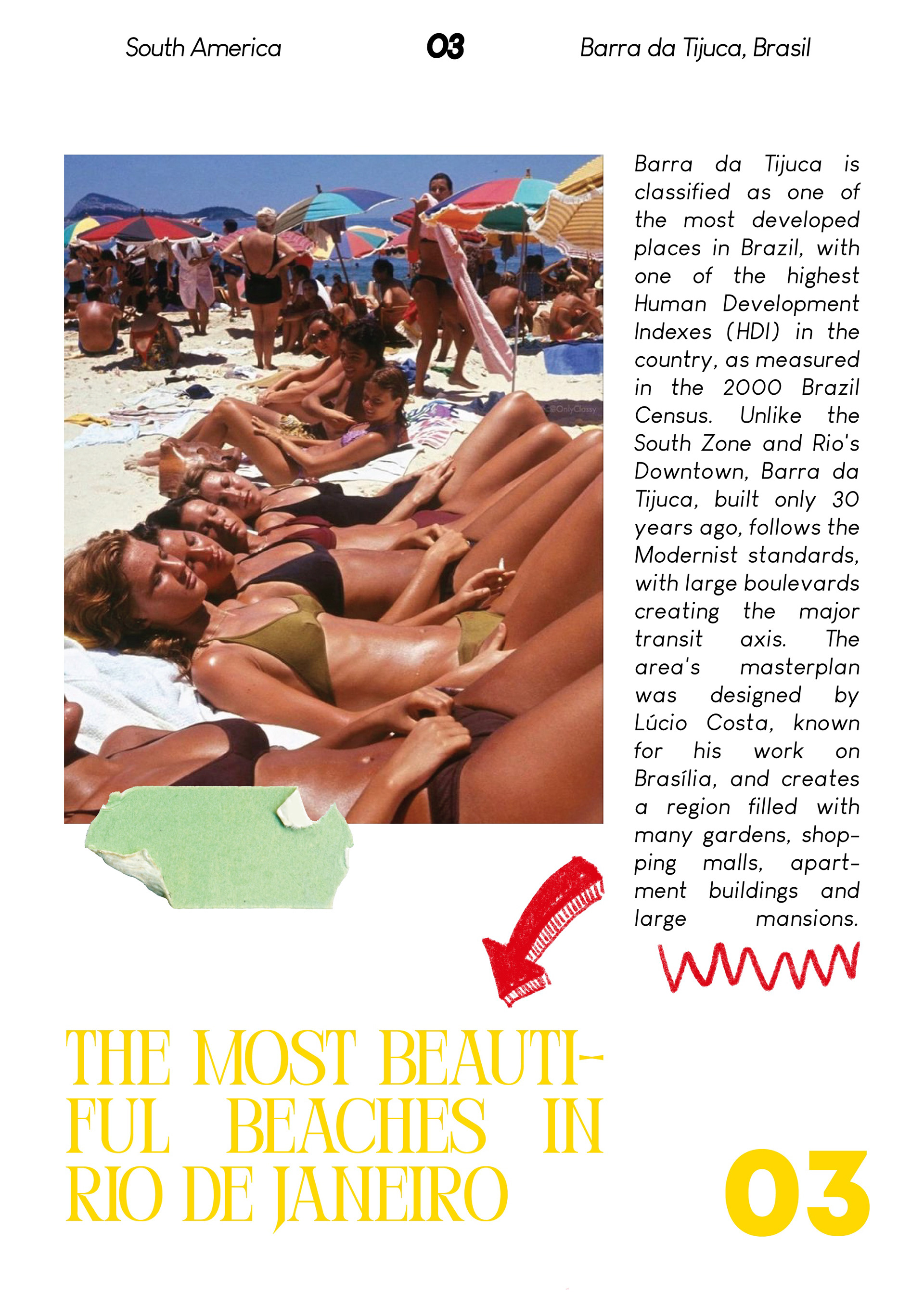
See below a minimalist approach to a travel magazine; using bold, sleek typefaces allows for more focus and attention on the imagery of each page. With sans serif headings and body, there is more room to explore unique layouts that play off of the image placement. The minimalist design philosophy aims to provide you with an uncluttered and immersive experience, allowing the beauty of Rio's shores to take precedence. By experimenting with composition, the minimal aesthetic is still able to be eye-catching and engaging.
Tools used: Illustrator